
Test
In law, clarity is power.
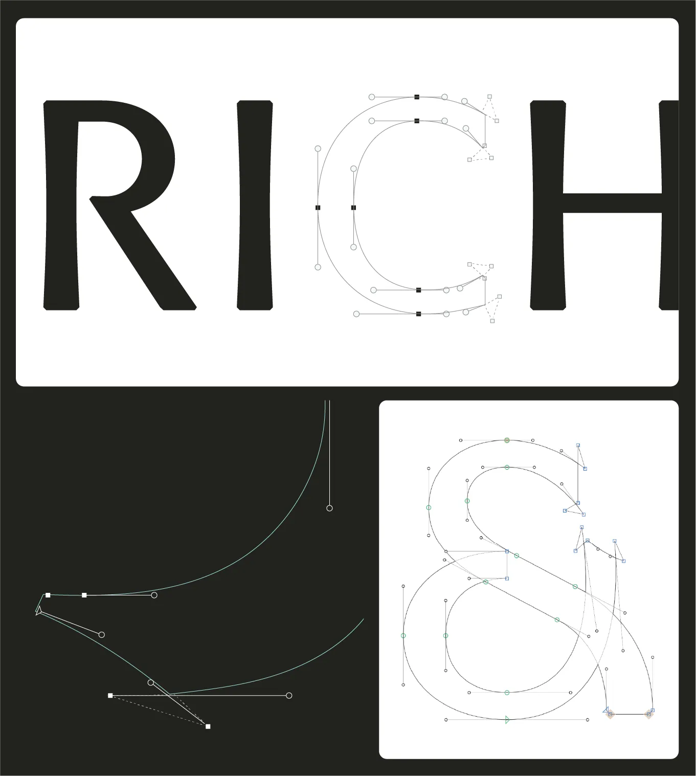
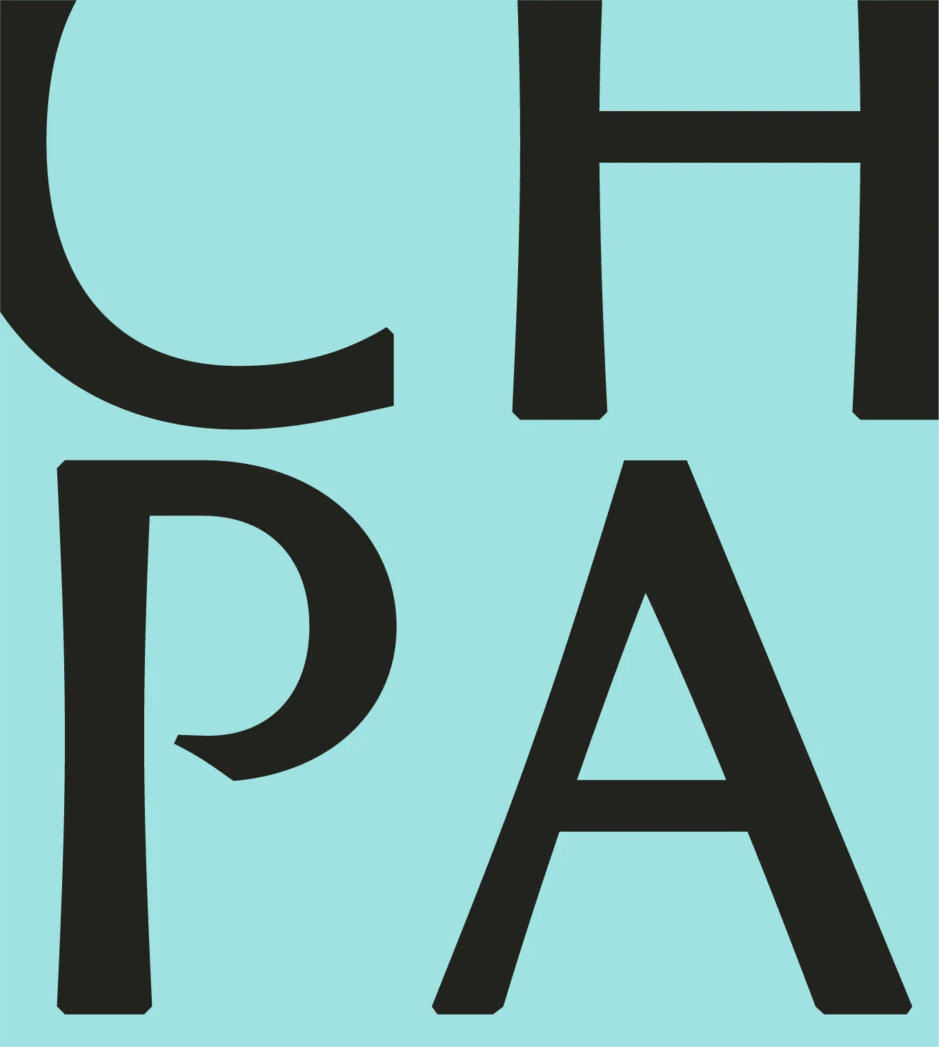
Brichta & Partners operate in a discipline defined by complexity. Legal frameworks, intellectual property, corporate structures -systems where clarity is essential. The new identity reflects this mindset. Built on structure, precision, and a confident visual language, the brand transforms legal expertise into something visible, contemporary, and unmistakably clear.
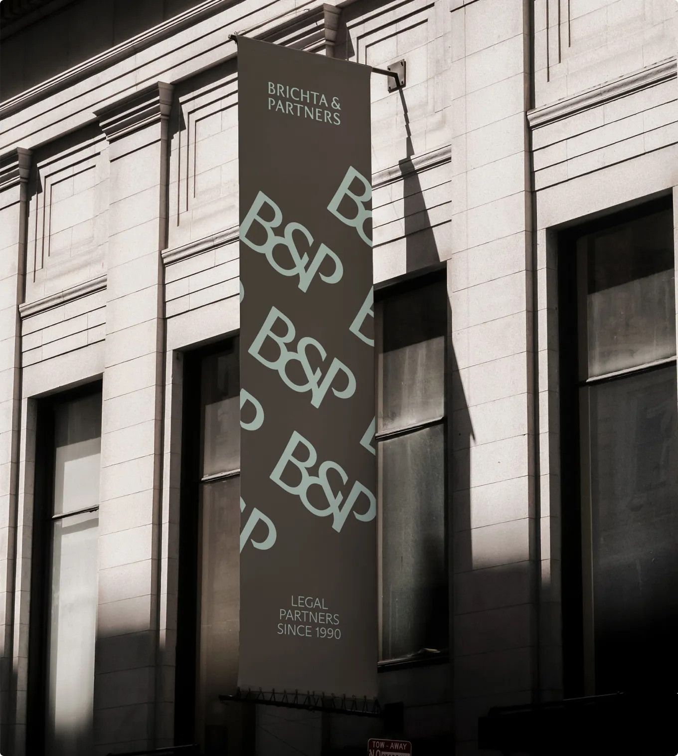
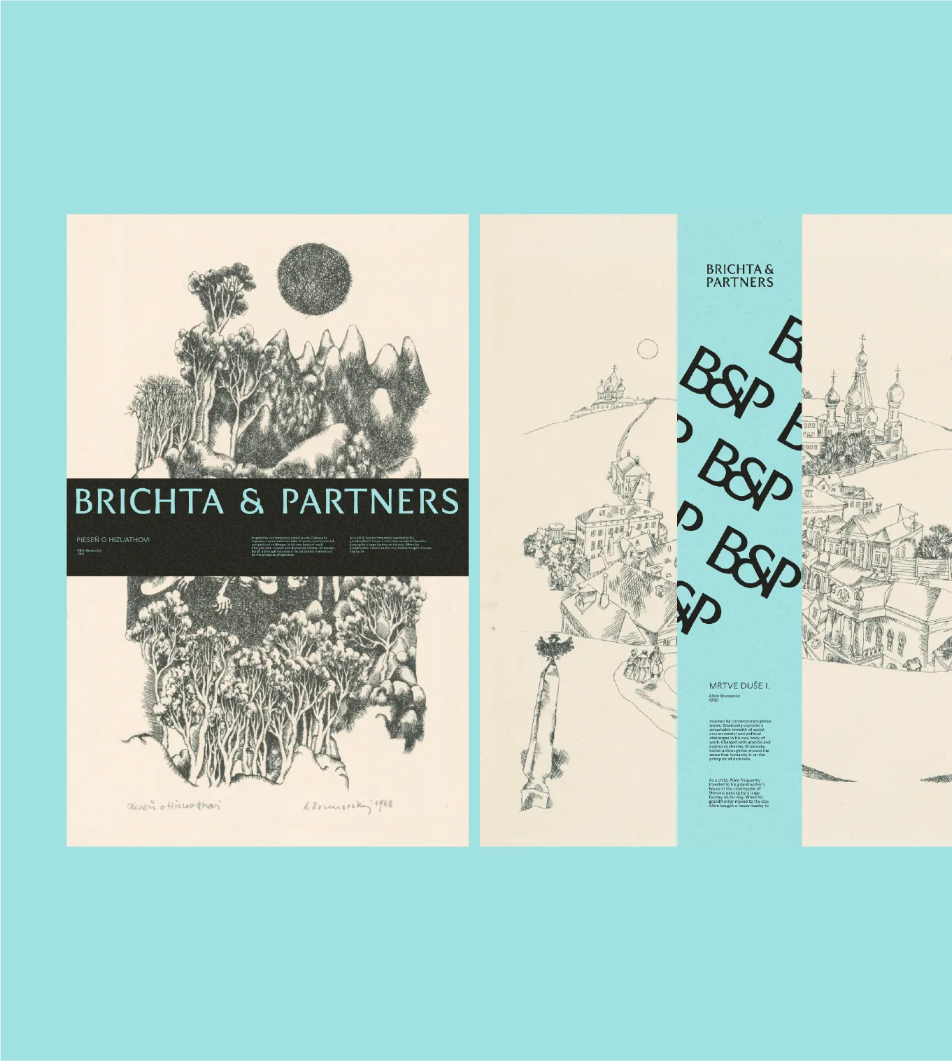
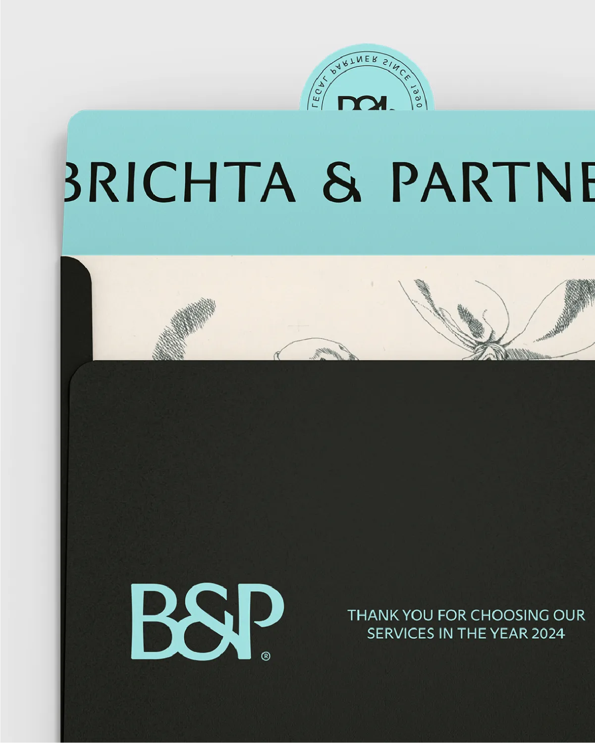
The identity was designed as a flexible system rather than a static set of assets. Typography, color, and graphic elements work together to create a consistent rhythm across communications. This approach transforms abstract legal expertise into something visual and tangible, allowing the brand to express complexity without becoming complicated.


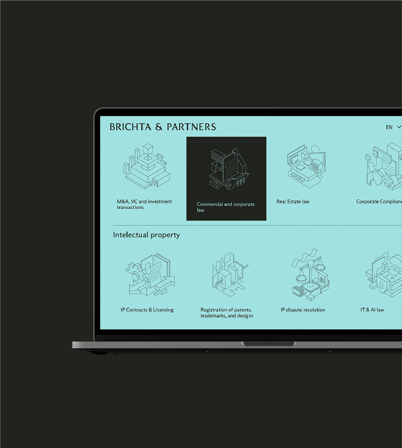
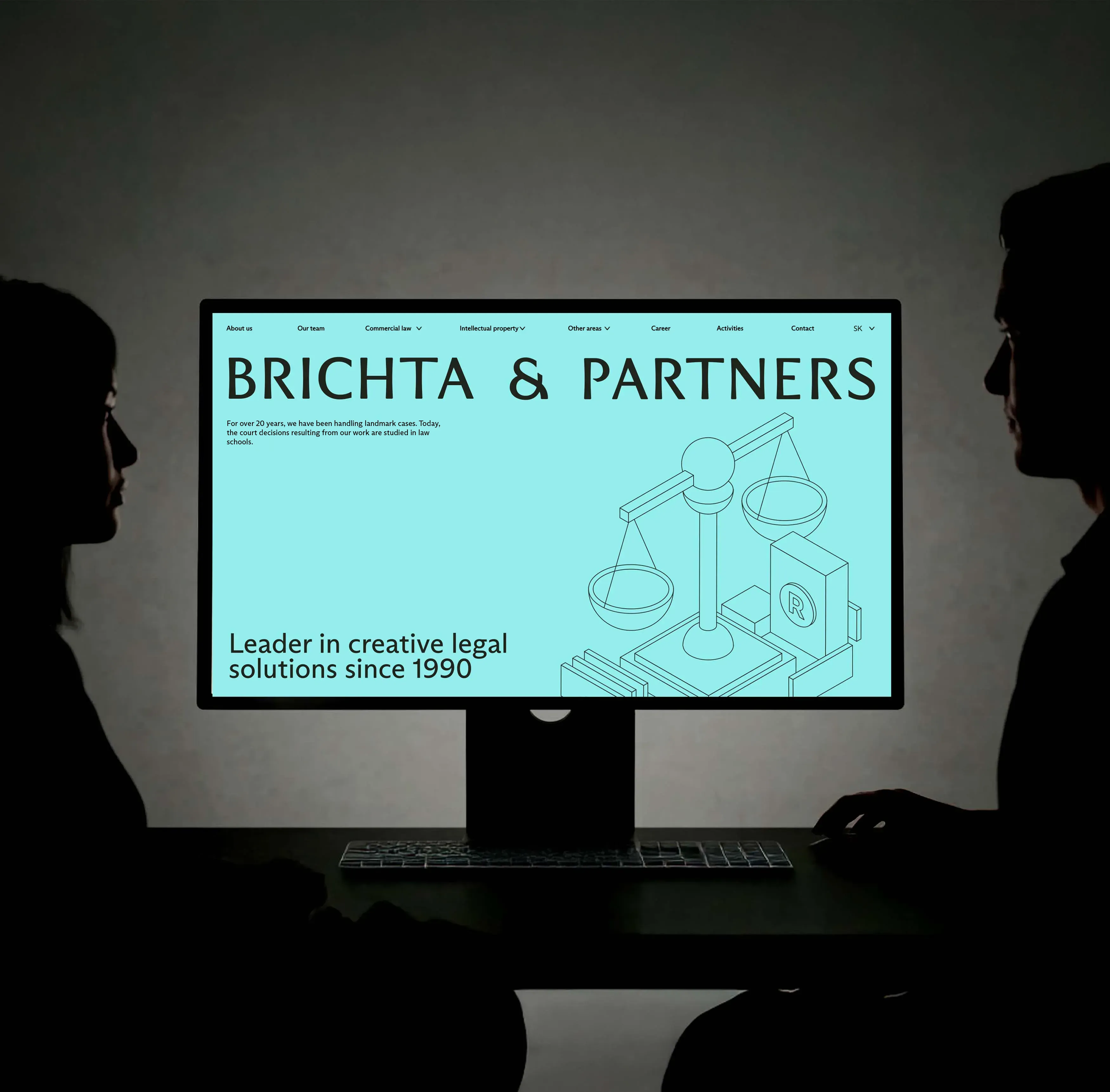
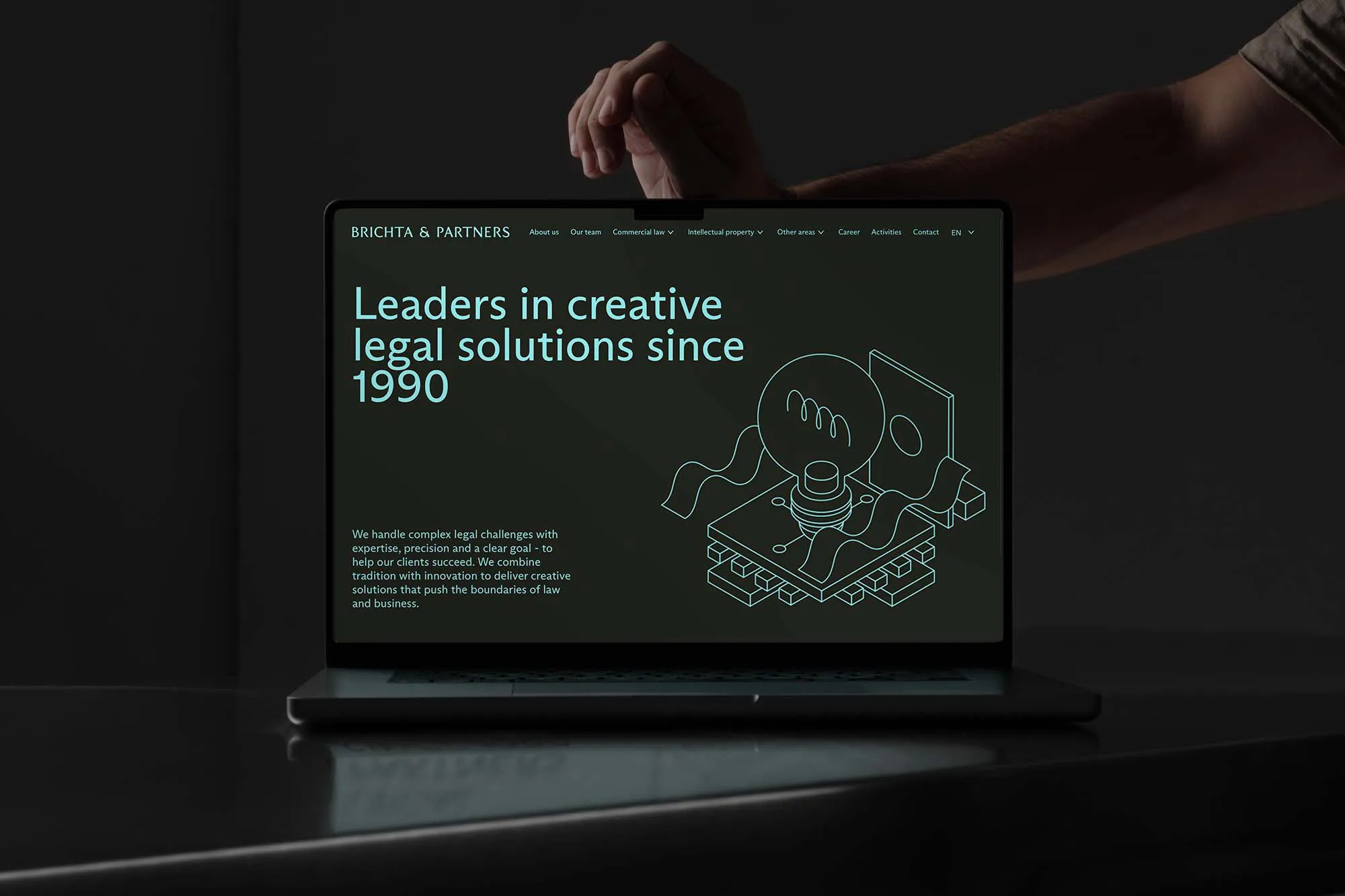
A restrained website interface, clear hierarchy, and structured content create a digital platform that feels intuitive and focused. The visual system translates naturally to the screen, allowing the brand to maintain its distinctive character while supporting clear communication.
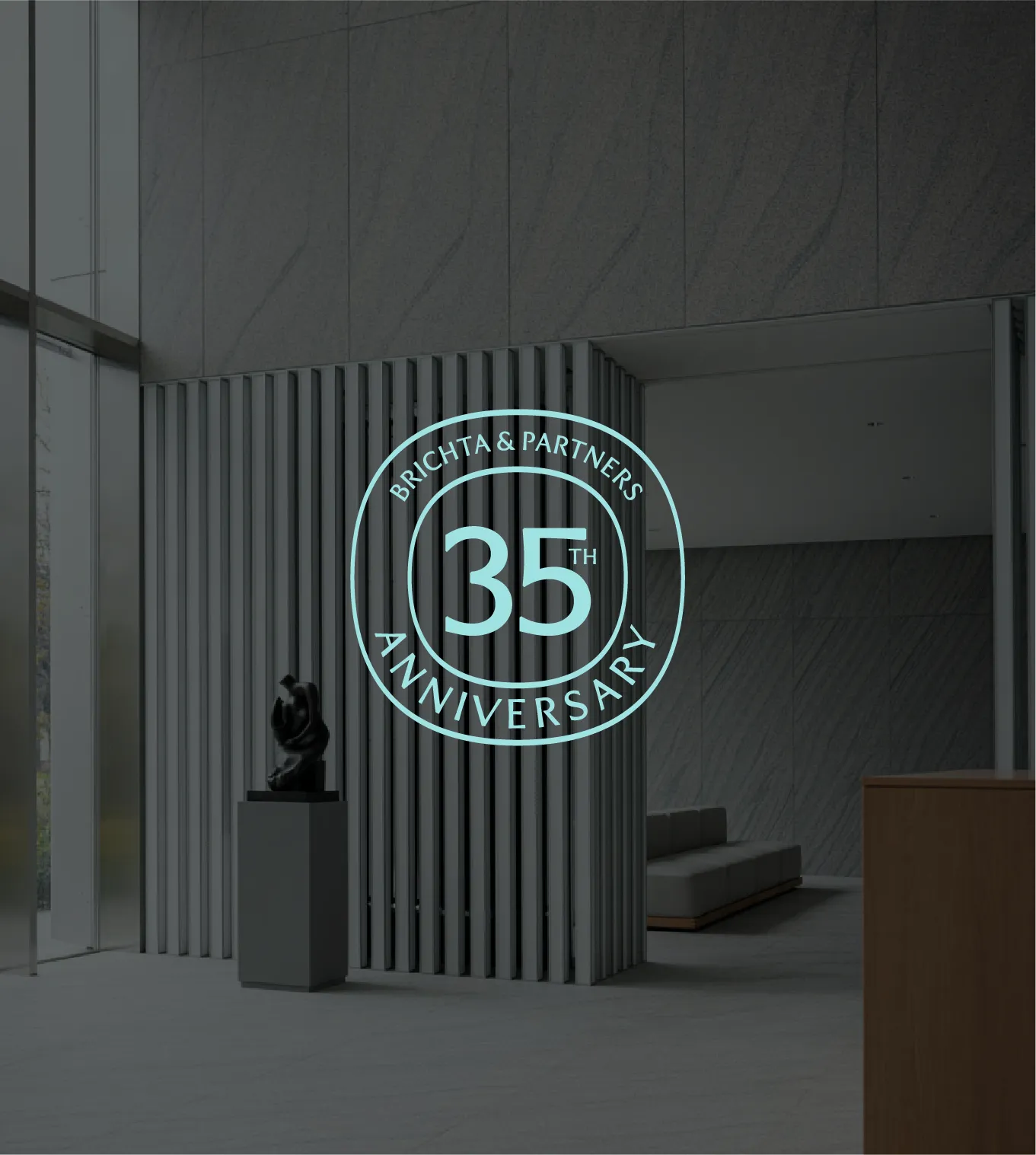
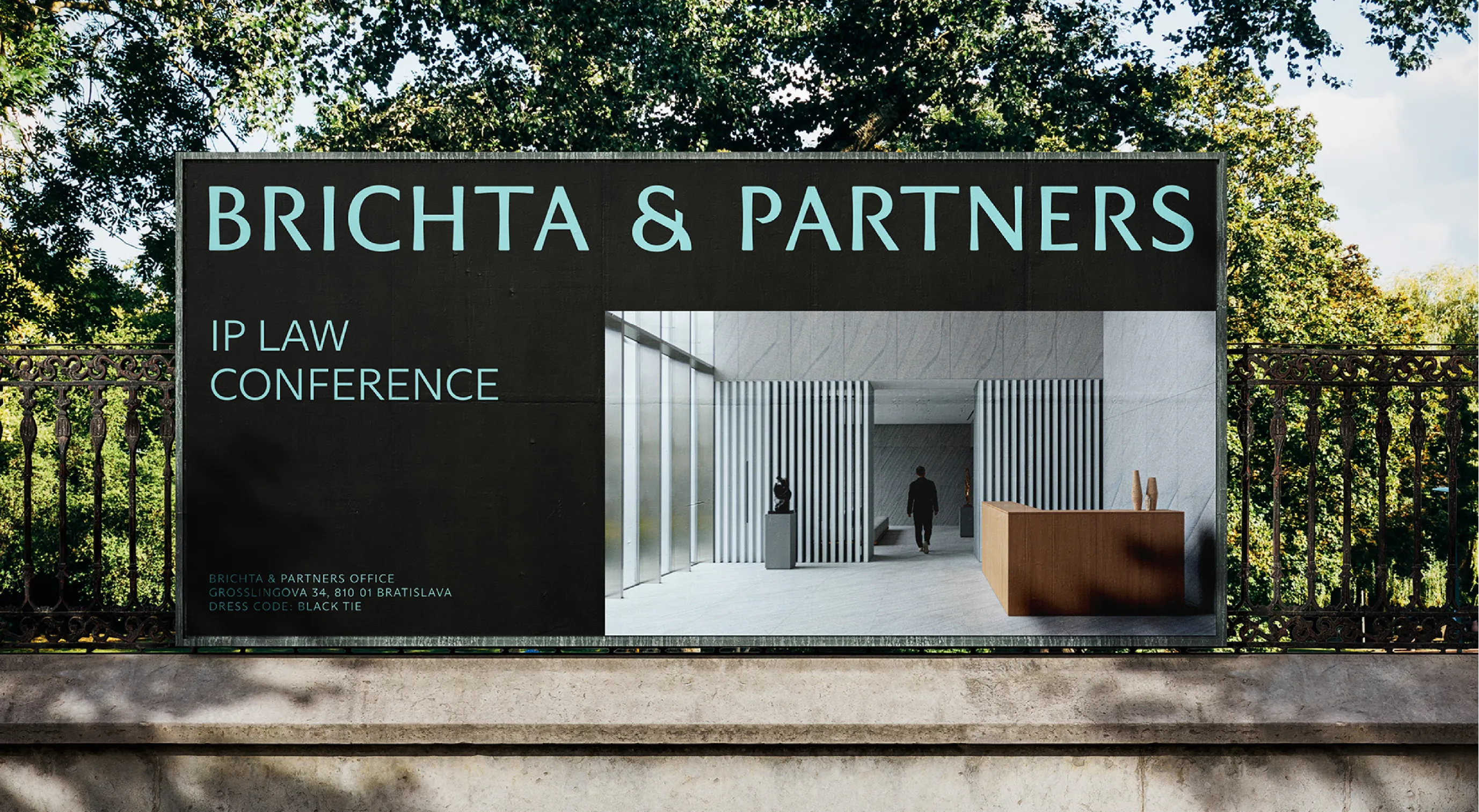
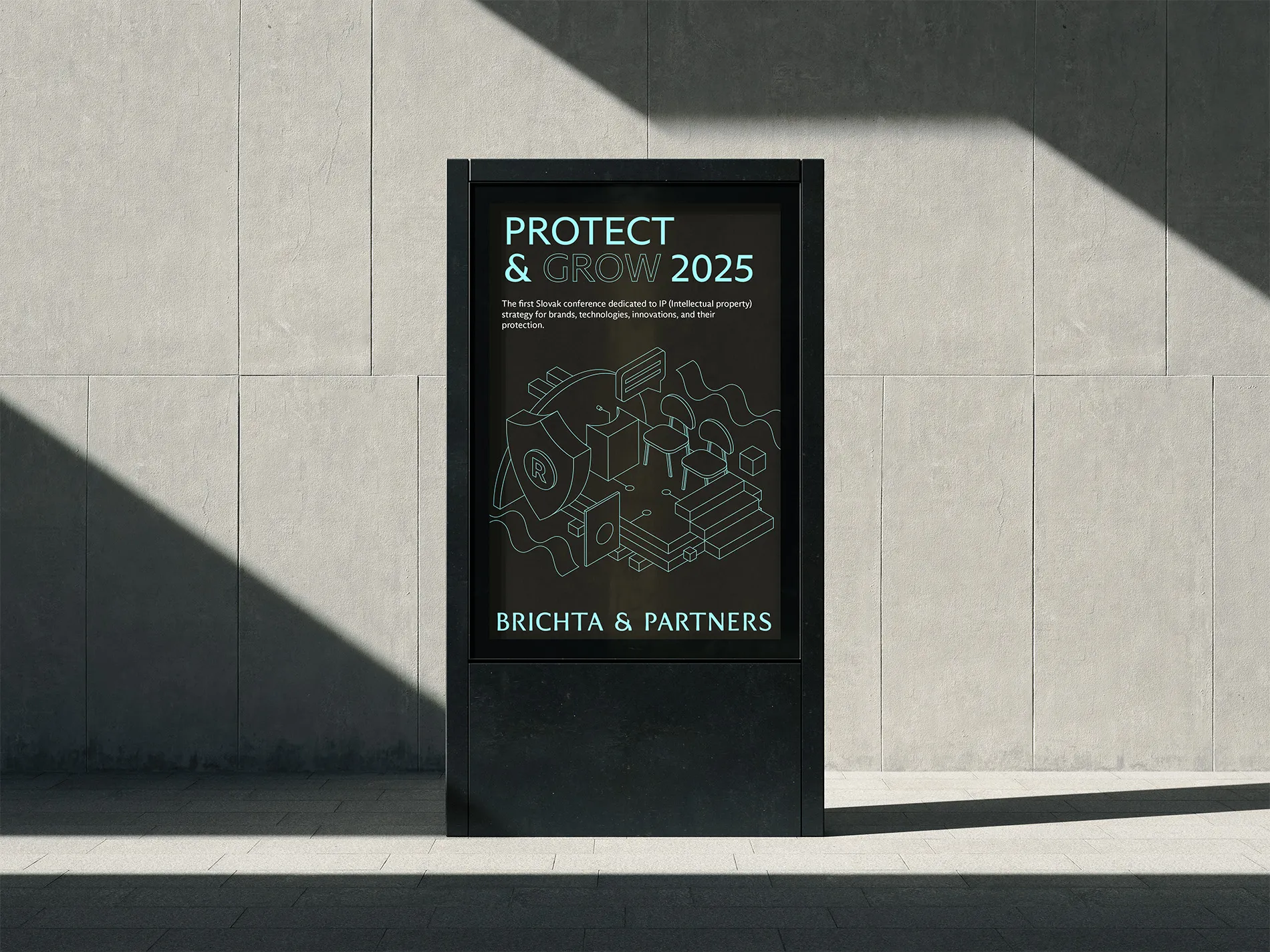
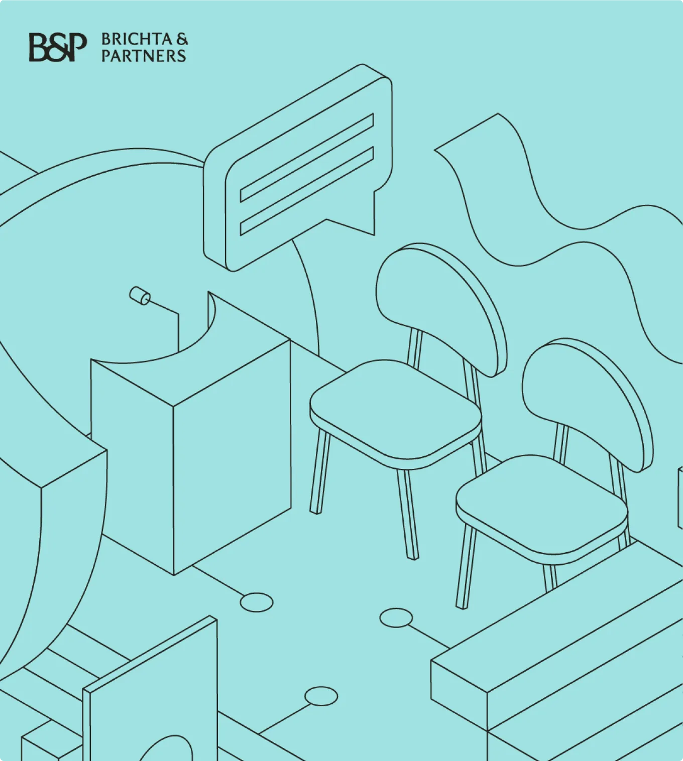
Beyond screens, signage, office graphics, and spatial applications reinforce the brand’s calm and structured presence. The visual language integrates naturally with the architectural space, creating an environment that feels both professional and contemporary.