Gymbeam
Test
GymBeam is the largest sports nutrition brand in Europe, growing fast in a crowded e-commerce market. That pace called for a brand system that stays recognisable everywhere it shows up, from shelf to screen to community.
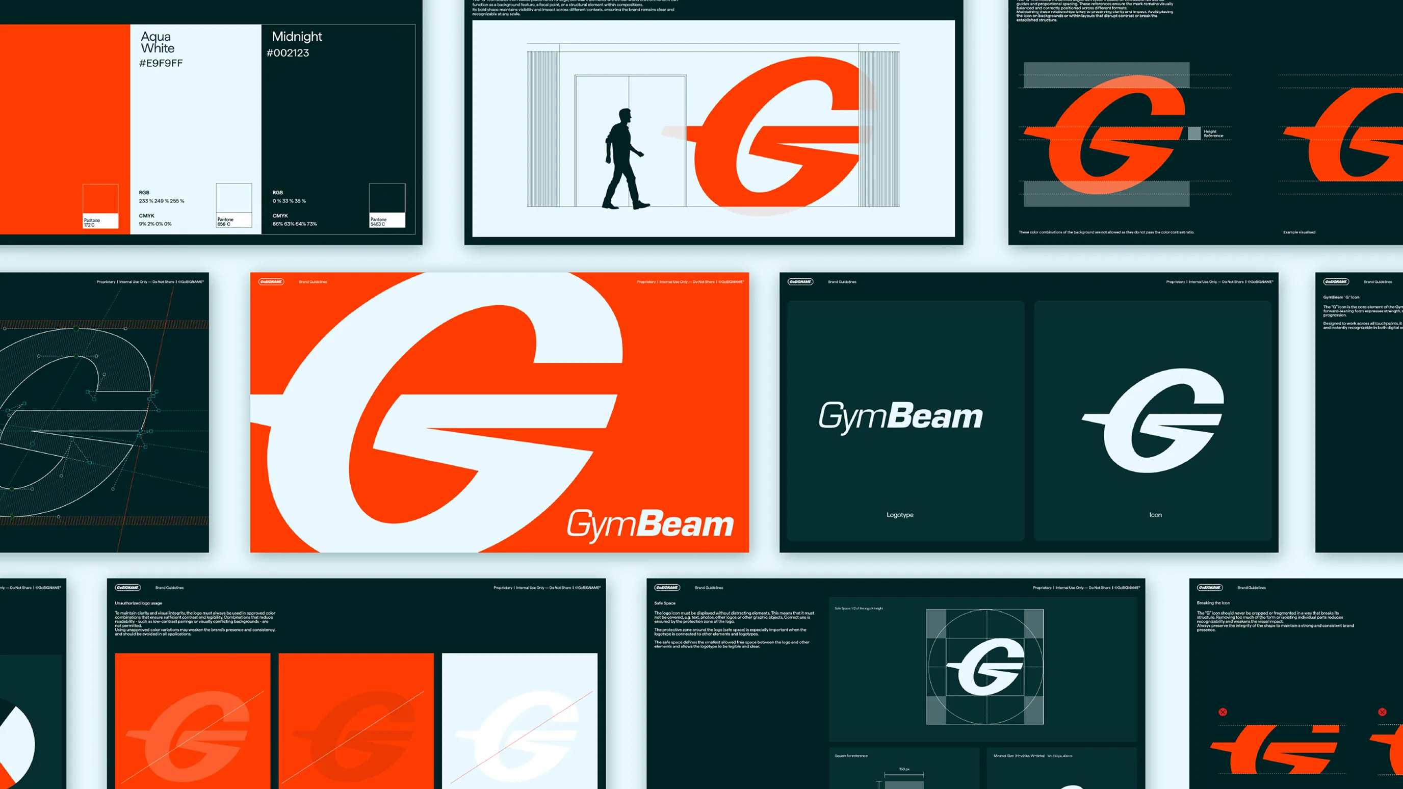
GoBIGNAME rebuilt GymBeam's #BRANDCODE system with a new colour palette led by a bold orange, a redesigned logo icon, and a scalable packaging system.
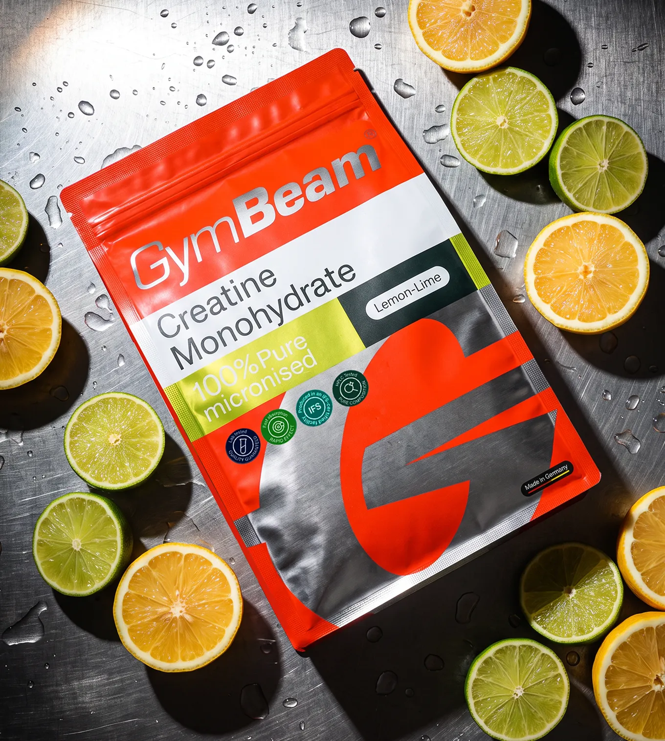
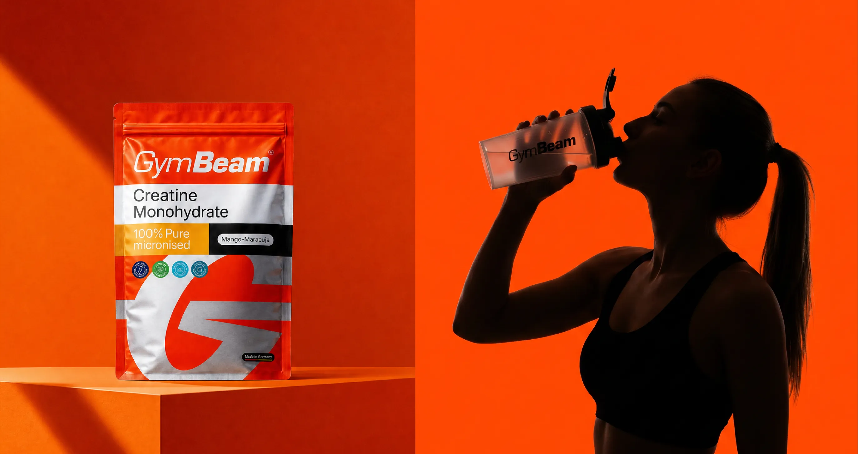
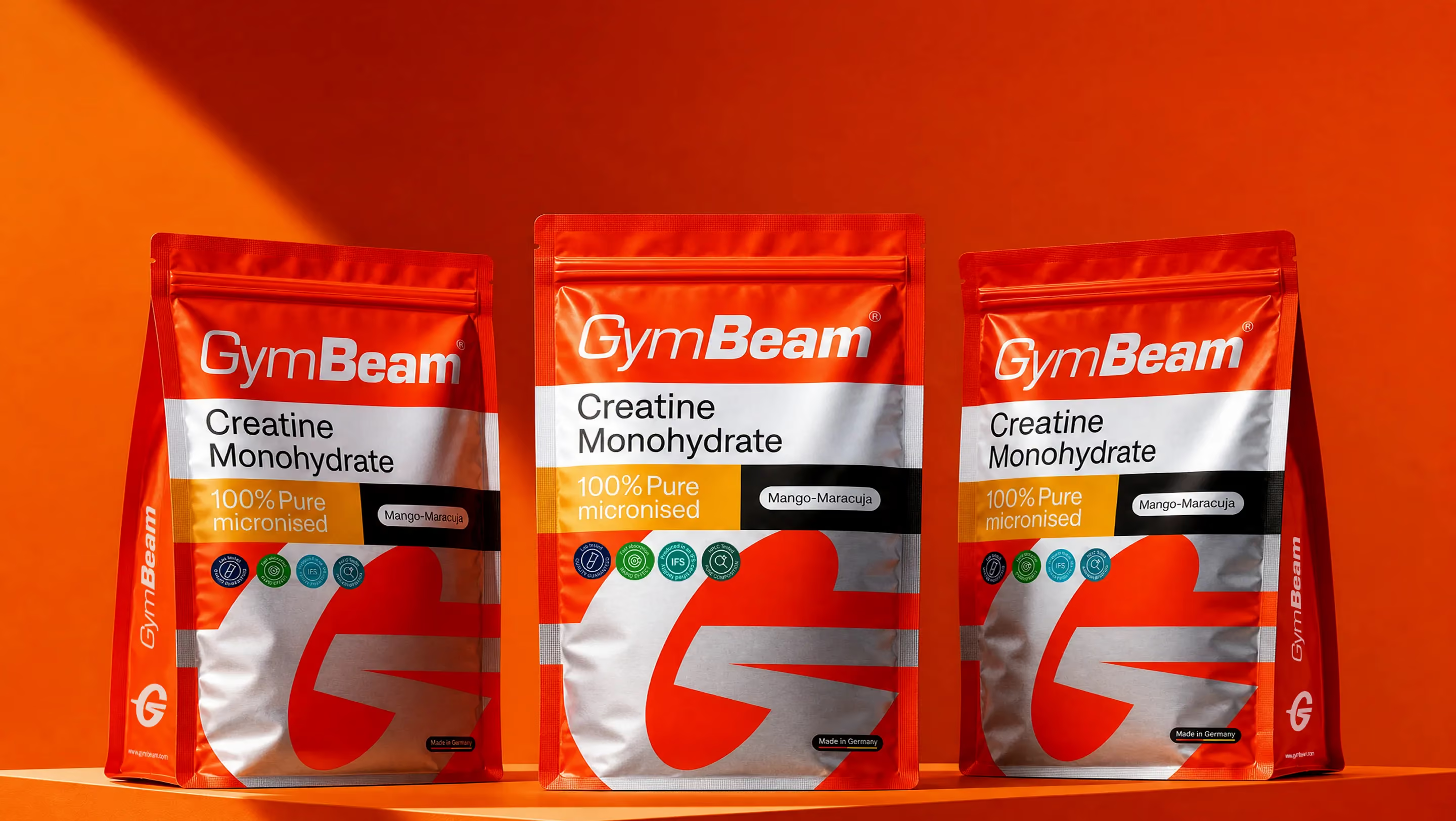
At the centre sits the GymBeam 'G', shaped into a flexible visual device that drives layouts, patterns and movement across the whole brand. More than a symbol, the 'G' ties communication, packaging, digital spaces and sonic branding into one coherent identity that holds up at every scale. The packaging starts with the creatine pouches, built on a bright orange base and a large, confident 'G' that anchors the line and gives it strong shelf impact through high contrast, simple structure and a clear typographic hierarchy.
The result is a unified ecosystem made for modern attention spans, maximising the recognition and consistency GymBeam needs to keep growing globally.


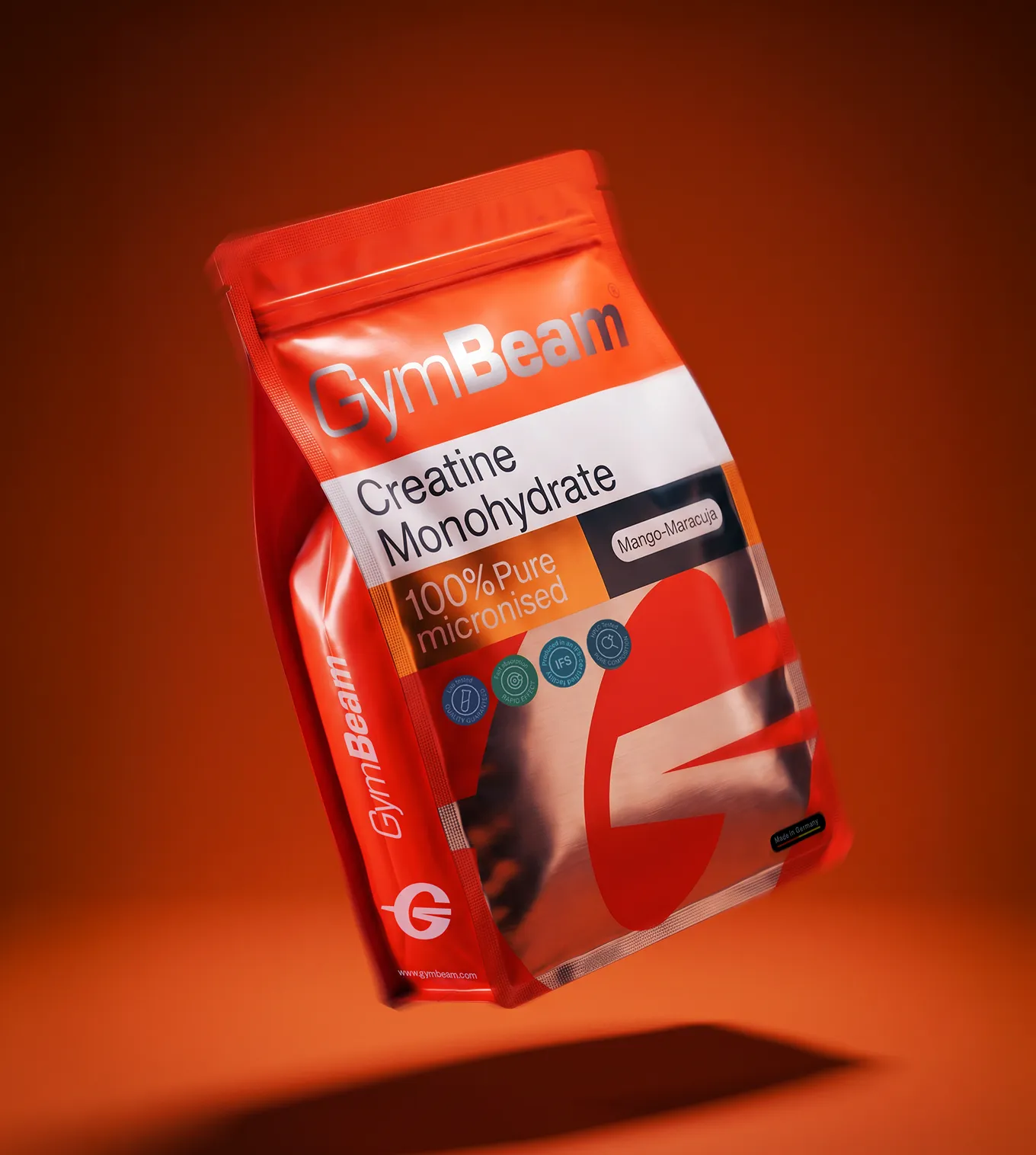
At the heart of the system is the GymBeam “G”, designed into a distinctive visual foundation that shapes layouts, patterns, and movement across the entire brand. It becomes more than a symbol, acting as a flexible device that connects packaging, communication, and digital spaces into one coherent and instantly recognizable identity.


“The result must not just be a simply new look, but a unified ecosystem built for modern attention spans, capable of moving seamlessly between shelf, screen, space, and community while remaining instantly recognizable at every scale. ”


Across every touchpoint, the identity stays consistent yet adaptable, moving easily between packaging, digital, and physical spaces without losing clarity. The system is built to scale, allowing expression and variation while maintaining a strong core structure anchored by the GymBeam “G” and its visual language.


The packaging system starts with the creatine pouches, defined by a bold bright orange base and a large, confident “G” that immediately anchors the product line. Built for strong shelf impact and clarity, the design combines high contrast, simple structure, and a dynamic typographic system to create instant recognition and a clear hierarchy across the range.