


Test
For years, Poliklinika Bezručova has been a trusted part of everyday healthcare. As the clinic evolved, the brand needed to reflect a more contemporary, human-centered experience while preserving the familiarity and trust people already knew.
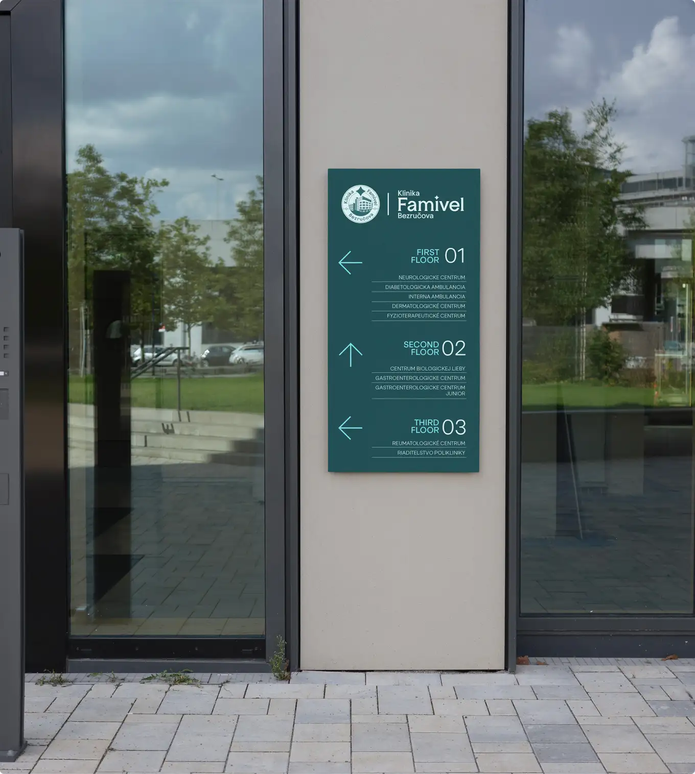
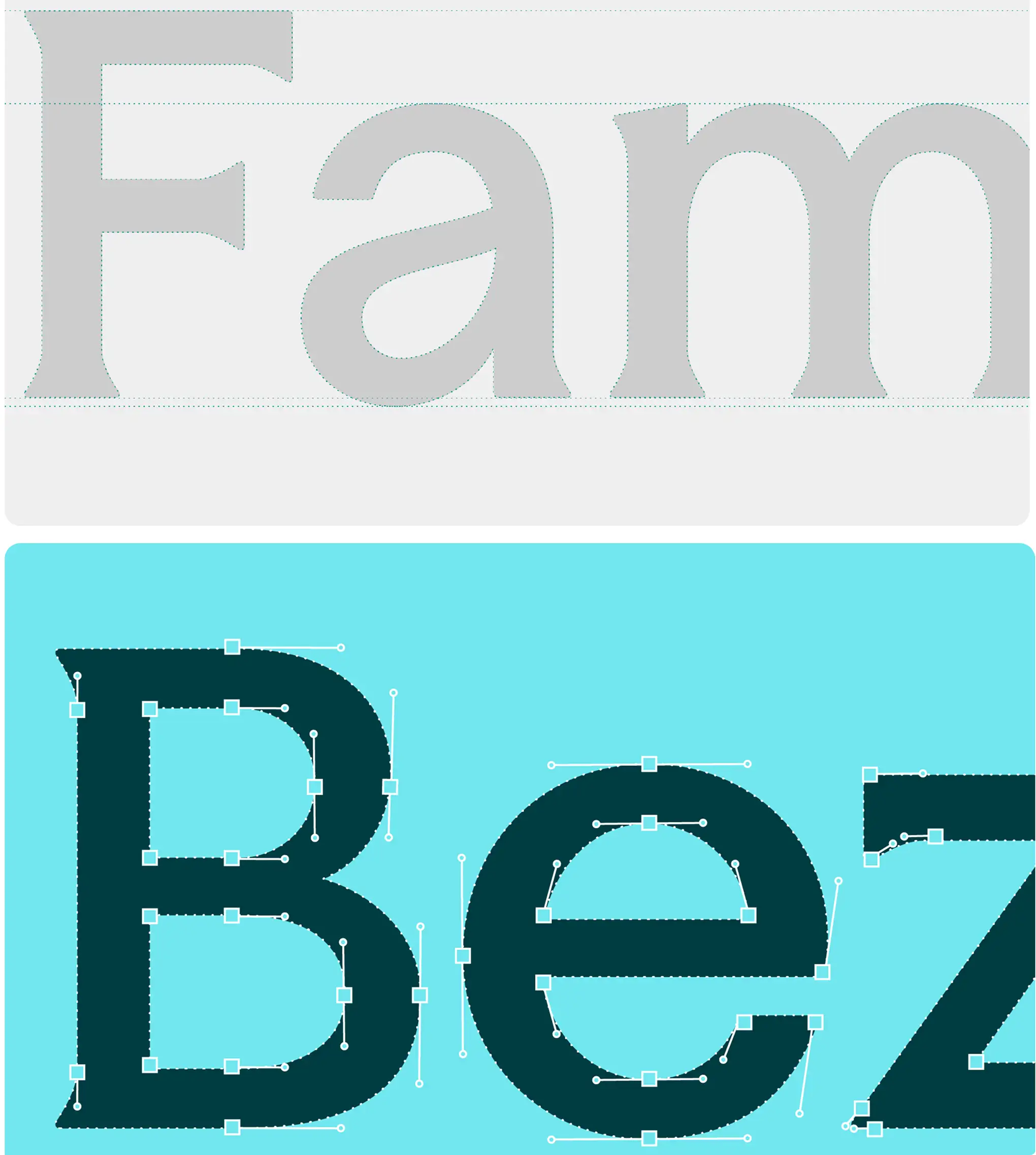
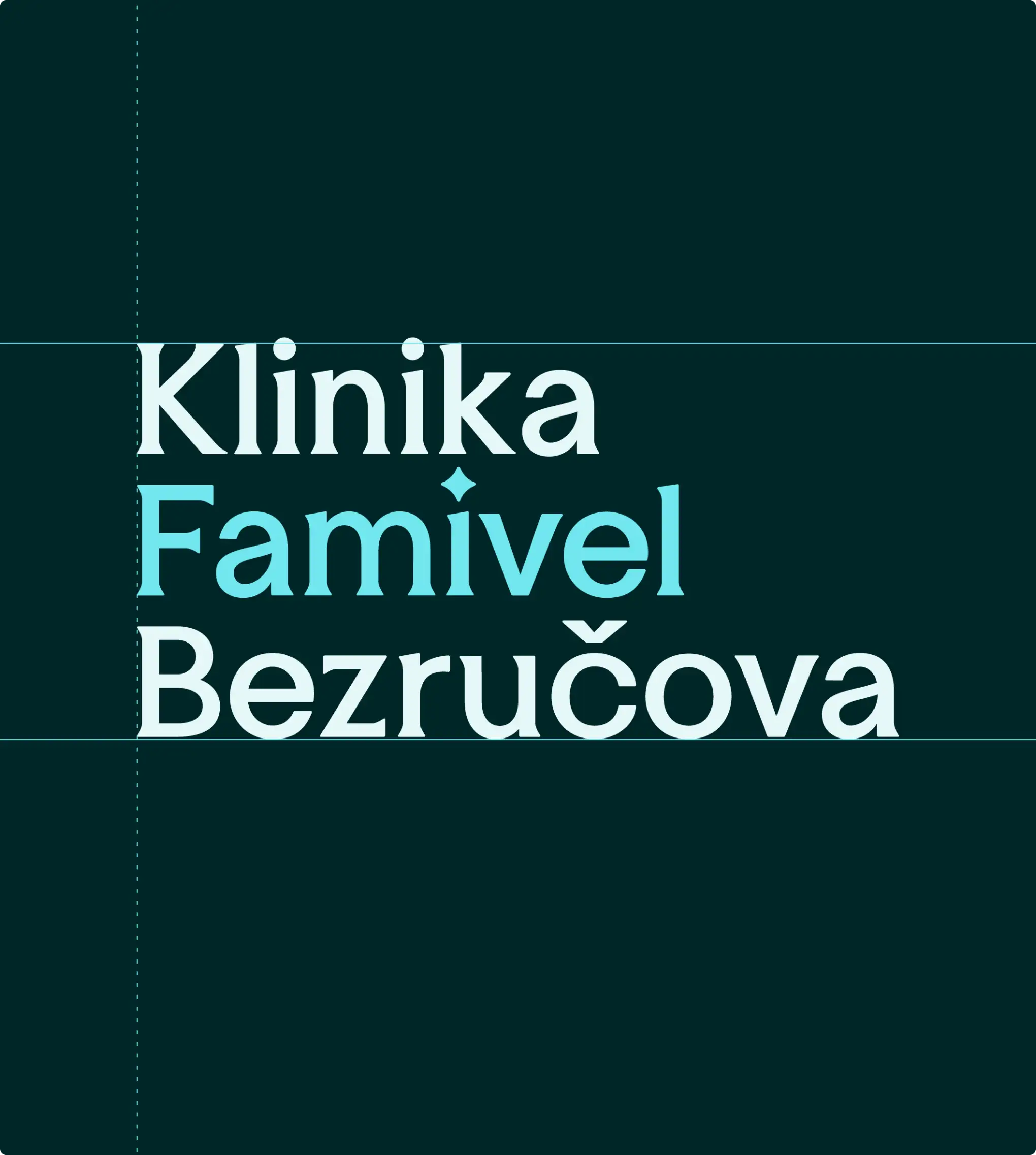
The transition to Klinika Famivel Bezručova marks more than a new name. It introduces a refined identity designed to bring greater clarity, warmth, and cohesion across every touchpoint.
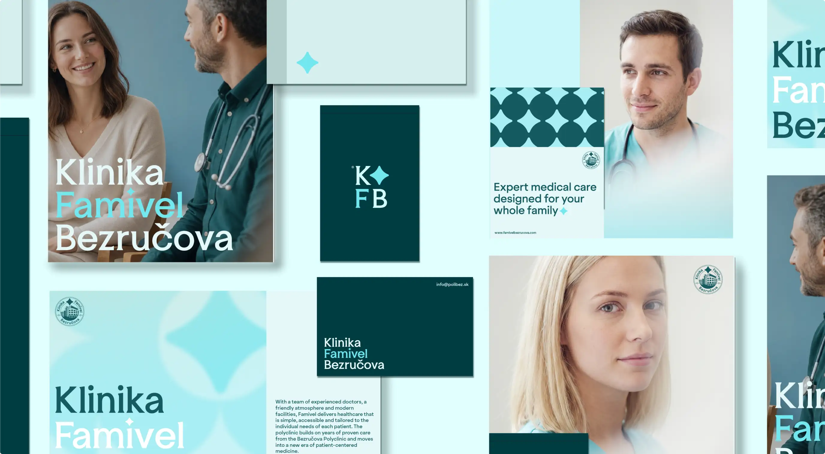
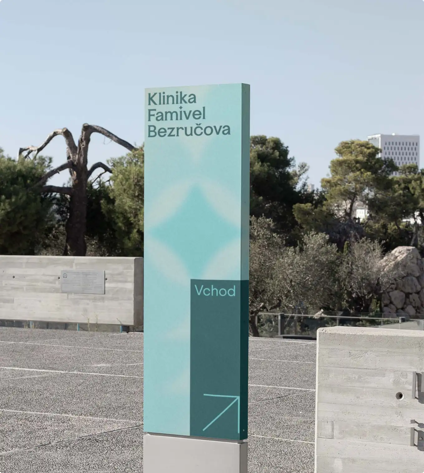
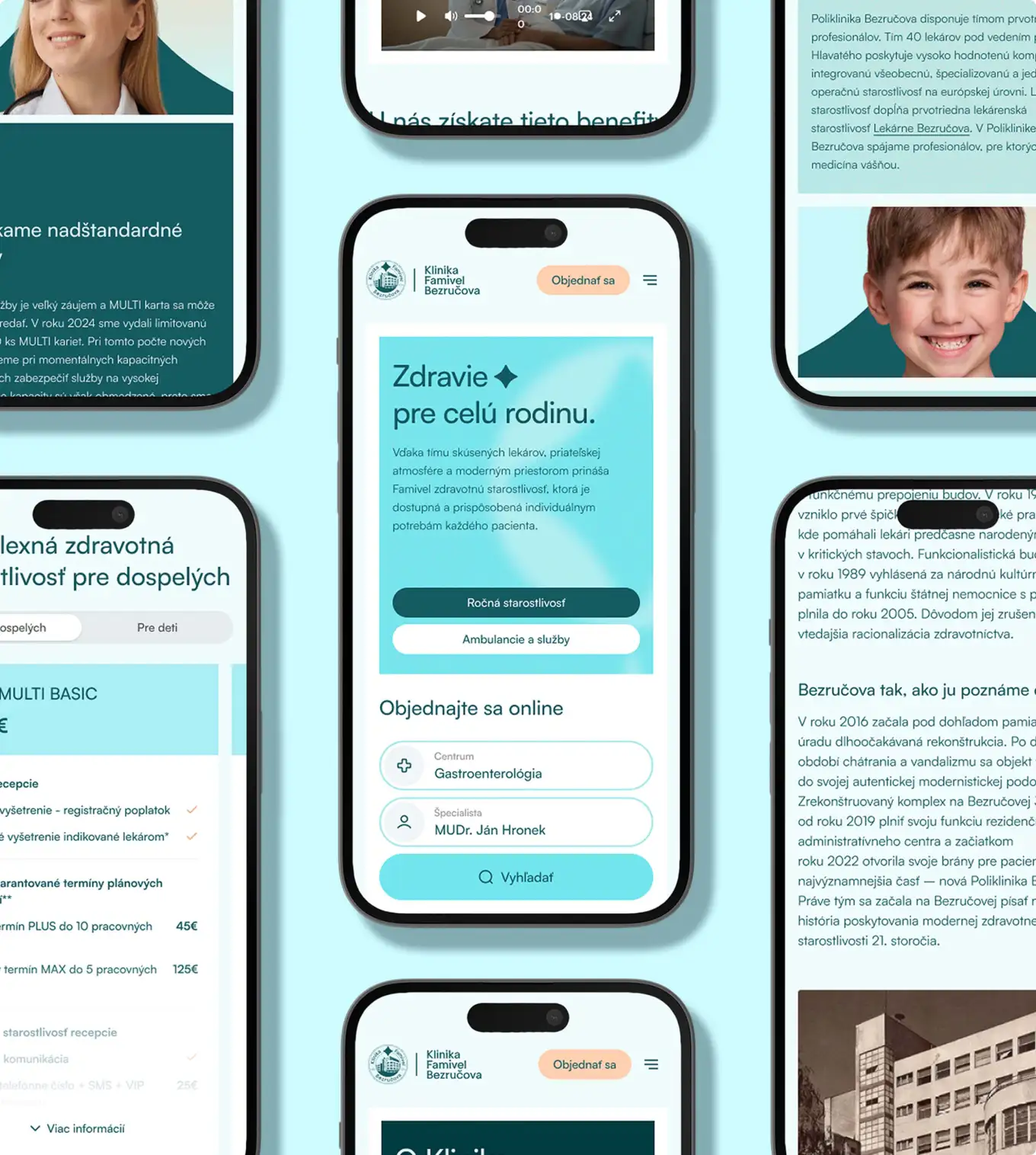
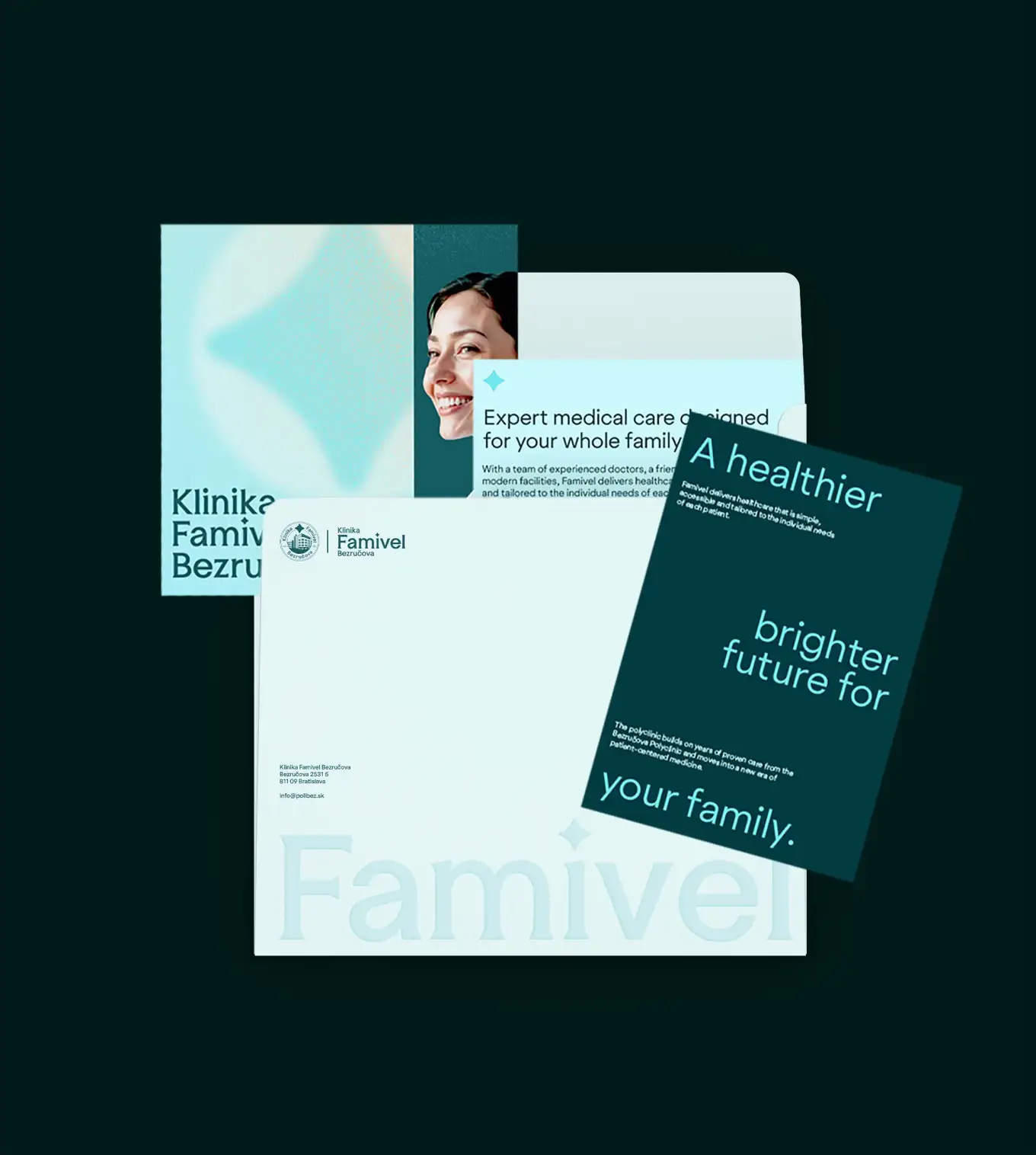
The palette is built around pale sky blue and aqua white, colours that feel more like a calm morning than a waiting room. Where most healthcare brands reach for navy and grey to signal expertise, Famivel reaches for light, air, and warmth to signal comfort.

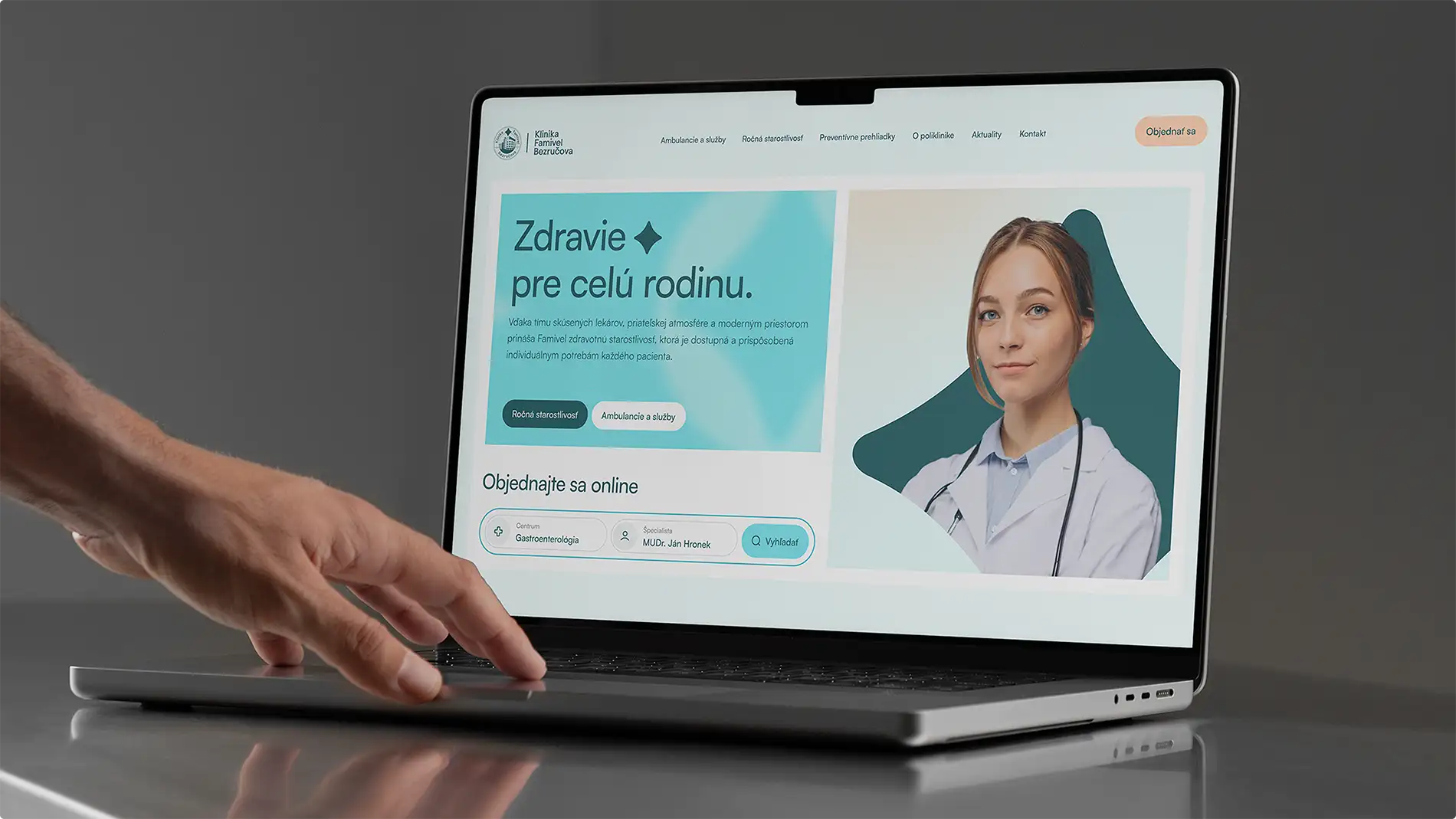

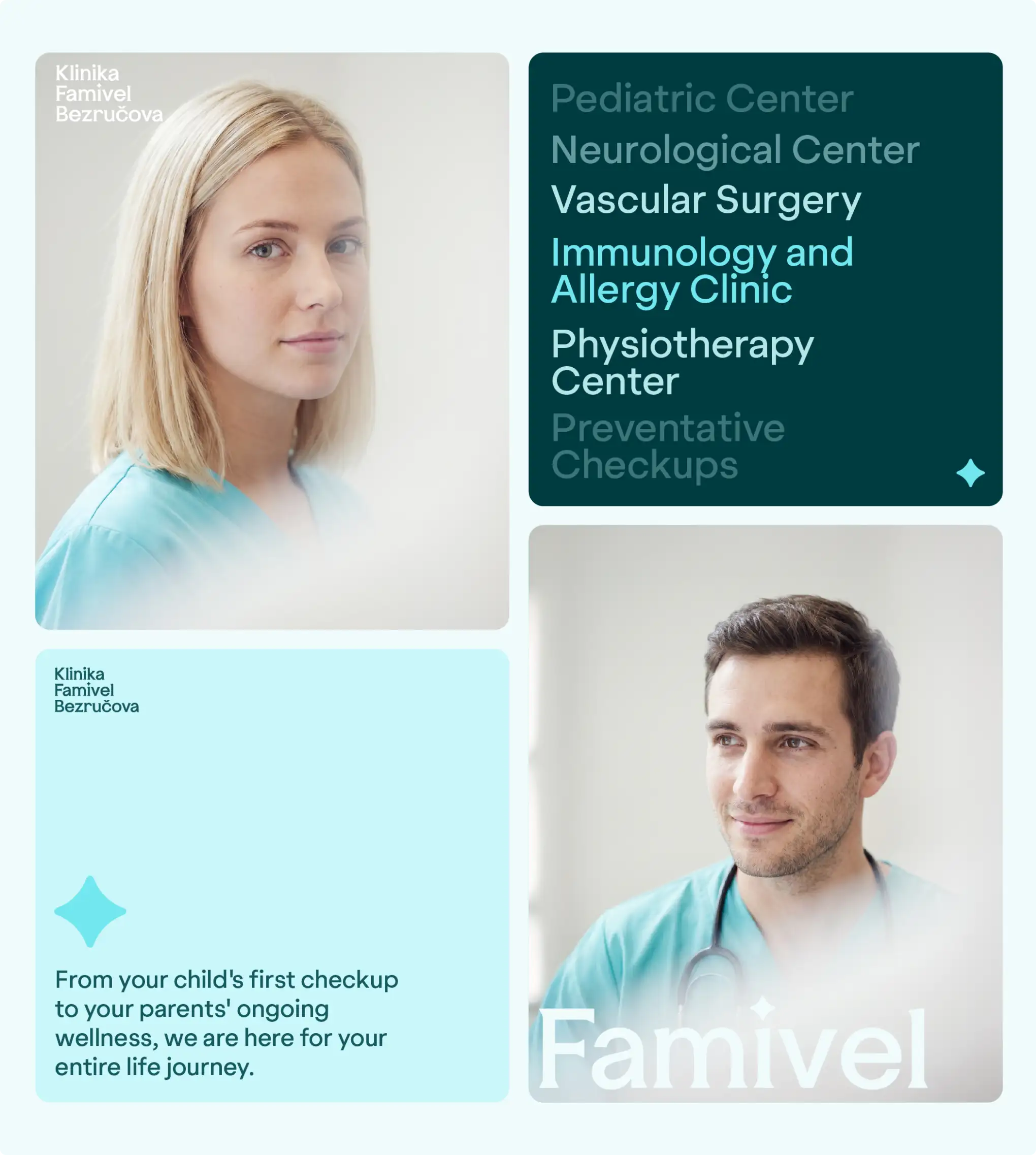
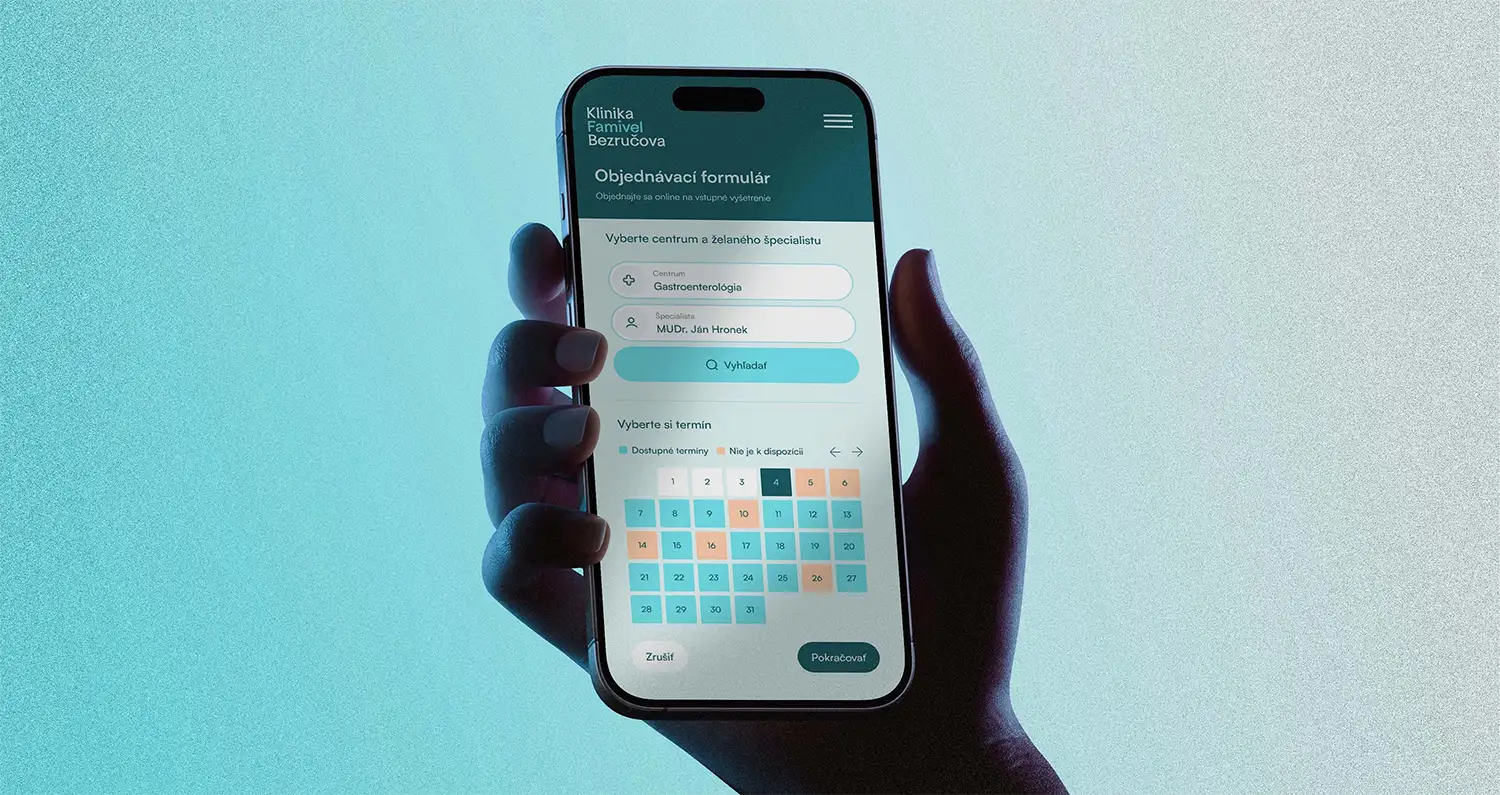
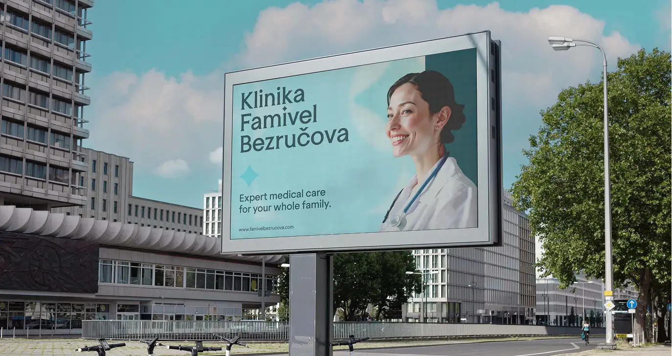
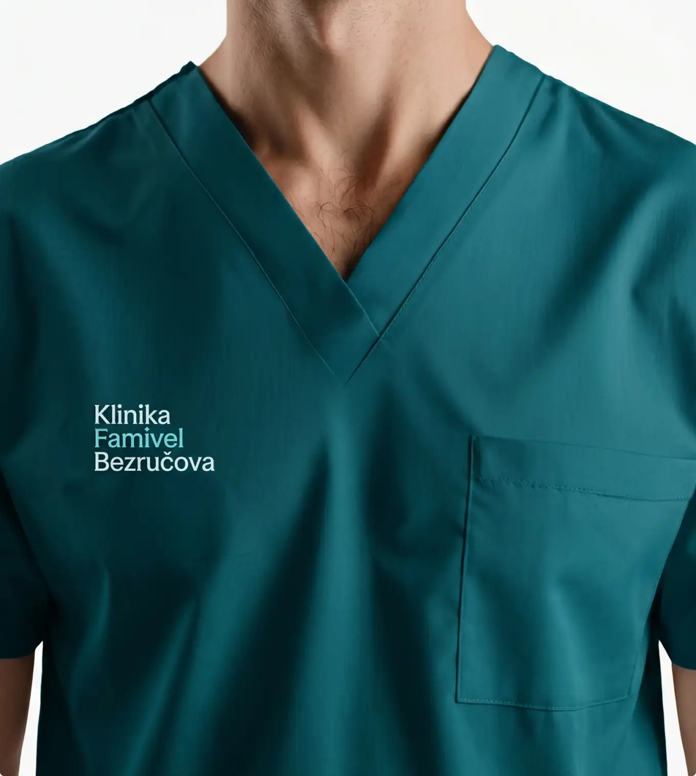
The system was built to flex from the smallest touchpoint to the largest. On paper: business cards, brochures, and stationery carry the same light palette, with the dark teal appearing only as an occasional anchor. Whether a patient meets the brand on a billboard on their commute or a phone screen at midnight, it reads as the same calm, familiar presence.


Klinika Famivel Bezručova isn't about looking newer, it's about feeling closer. A healthcare identity that leads with light instead of authority, and lets warmth do the work that used to be done by distance.