RimRebelion

Naming & Branding for cycling apparel store

Test

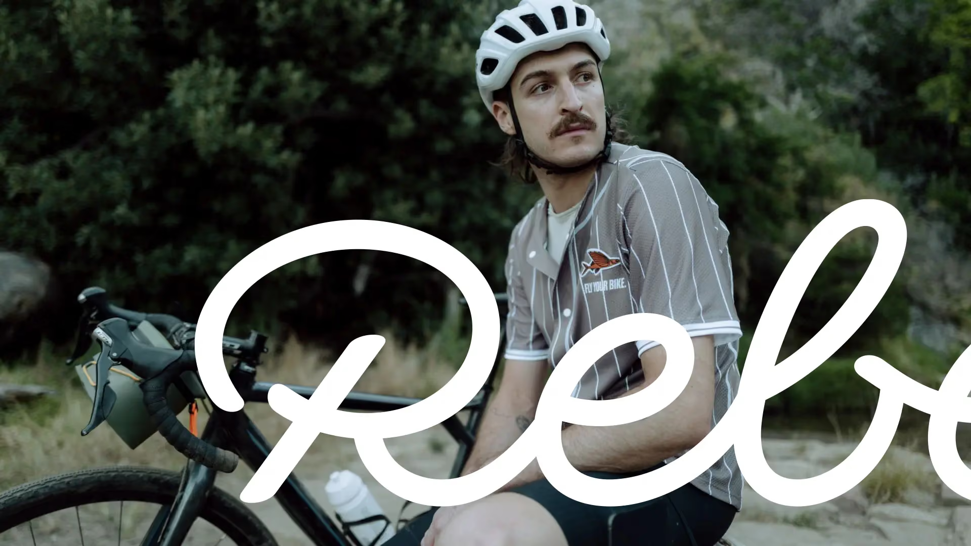
RimRebellion is a cycling apparel brand built for riders who push boundaries and explore the unknown. The brand needed a name and identity rooted in cycling culture, distinctive enough to be recognised from a distance. GoBIGNAME created the name RimRebellion, playing on 'rebellion' to capture brave, confident cyclists, and built a narrative grounded in cycling tradition and the exploration of the environment. The badge shape draws on the wayfinding poles found on gravel roads, with emphasis on the word RIM so it works as an identifier visible from afar. Paired with bespoke script lettering, it adds a sense of tradition. We also advised on the eCommerce implementation, making sure the identity translates into a strong digital experience. RimRebellion later opened a physical store in the renowned Zwirn complex in the city centre.

White RimRebellion hexagon badge with “RIM”, script “Rebellion” and “EST’23” on a black isometric grid.
Black espresso cup and saucer with the white RIM badge and “Rebellion” script lettering, on black.
White outline of the script word “Rebellion” with vector anchor points on a black background.
Café table with smoothies and a bagel, overlaid with a RimRebellion event card “From Bratislava to Hainburg”.
Station platform billboard showing two people embracing, overlaid with the RimRebellion script wordmark.
Three black cycling bottles printed with RIM lettering, a white geometric pattern and Rebellion script.
Three RimRebellion Instagram stories in orange and black promoting new cycling jerseys, including “New arrivals”.
Black RimRebellion poster headlined “The badge of cycling Rebellion” with the white RIM logo in the corner.
RimRebellion product card for men’s training bib shorts over a photo of a cyclist in a pale helmet.

Credits